

Rebrand Case Study and My Role
QuadMed Rebrand
Most materials designed in this position are not allowed to be shared for personal uses on a portfolio
QuadMed, a healthcare services company with 500–1,000 employees and a sister company to Quad, needed to reposition after the COVID-19 pandemic. After losing several clinic locations, branding had become inconsistent across patient materials, signage, and internal communications. Messaging varied by client and department, creating confusion for patients and diluting trust in communications. Marketing teams were also spending significant time recreating assets instead of scaling campaigns.
In 2024, leadership initiated a company-wide rebrand to develop a unified visual system, clarify QuadMed’s voice, and create scalable tools to support growth and new client implementations.
My Role:
Led design execution and exploration for QuadMed rebrand across internal and external visual systems
Designed the new logo
Partnered with marketing leadership to design logo and develop brand standards
Built standardized launch packages for new client health-center implementations (stationery, signage, onboarding materials, benefits guides, grand-opening mailers), ensuring consistent brand rollout across new locations
Created reusable campaign templates for patient-education and utilization initiatives, saving 30+ hours per campaign
Directed photography, iconography, and layout standards across 60+ healthcare centers
Extended brand system to establish sub-brands for additional benefit programs
Created scalable templates for presentations, email, signage, and print
What improvements were made and why?
Color System & Hierarchy
Primary: Navy (always present for brand recognition)
Secondary: Supporting blues for flexibility
Tertiary: Limited accent colors for emphasis
Why: Ensures instant brand recognition across touchpoints, prevents color drift in a large healthcare organization, allows scalable product differentiation without fragmenting the brand, improves accessibility and visual clarity, saves time across the organization by making collateral, communications, presentations easier to build.
Typography
Updated fonts to align with logo changes and standardized body copy for readability across presentations, marketing, reports, and charts.
Why: Faster content creation, clearer communication, fewer formatting issues across departments, majority is brought in-line with the family of companies (body font).
Layout templating system
Standardized placement of:
Titles
Logos
QR codes
Legal language
Form fields
Created shape components for callouts and emphasis.
Why: Scalability to grow with faster rollout of compliant materials across clinics and departments. Healthcare requires compliance and database integration, staff outside marketing create materials daily enables templating for increased flexibility and independence across the company, reduces human errors and legal risk.
Brand Voice
Shifted tone to speak confidently as QuadMed, emphasizing clarity, professionalism, and confidentiality.
Why: Patients should be able to trust their medical provider with their health, and corporate clients need a partner that communicates with clarity and authority. A consistent brand voice reduces confusion across patient-facing content, while clear boundaries strengthen trust and improve communication with both patients and employers. That trust enables QuadMed to speak with authority and deliver meaningful insights around healthcare and ROI.
Illustration & Iconography
Standardized vector illustration style and created 2-color filled icon system from a defined library.
Why: Healthcare education materials must be clear and fast to produce, allow flexibility in topic expression without becoming a sticker sheet, consistent icons improve comprehensive and brand recall.
I utilized AI (ChatGPT) to take over 40 documents, recolor, break each icon into multiple file types, apply meta tags, label and catalogue for company use via SharePoint.
Print & Digital Work
QuadMed Everywhere Physical Therapy campaign (Mailer featured): Introducing a new addition to the product and demonstrating how it can be helpful for the patient in order to overcome the idea that a physical therapist has to touch you in-person to make progress. Digital and further print assets were created with the same imagery.
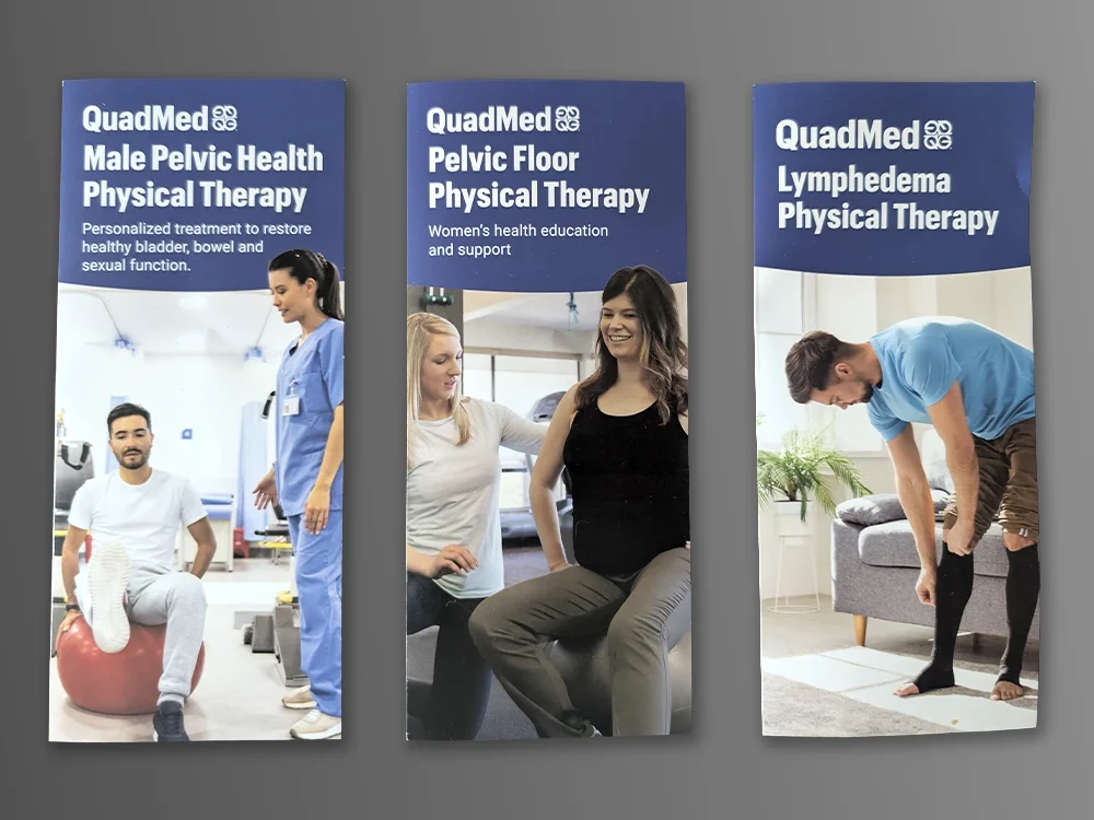
Physical Therapy Brochures (Covers) rebranded and updated to better address questions for patients and introduce their provider.
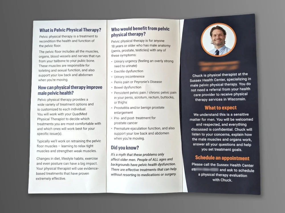
Physical Therapy Brochures (Inside) rebranded and updated to better address questions for patients and introduce their provider. Also acts as a follow-up to campaigns for provider promotions when they join a clinic.
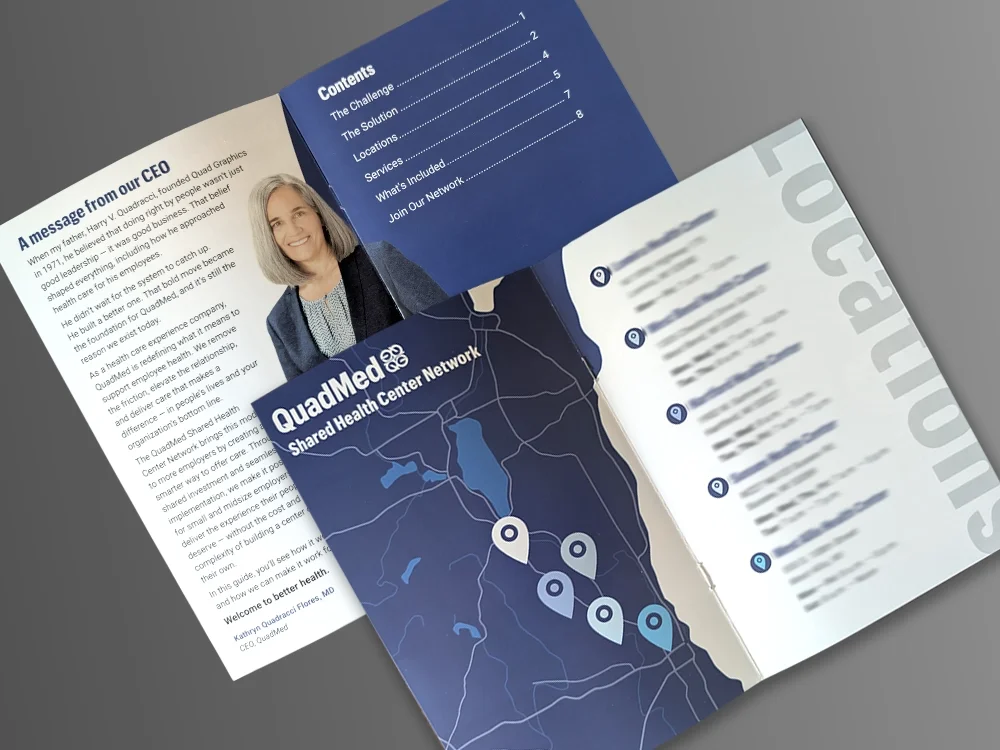
Introduction book to QuadMed for clients that depicts their accolades and packages available (censored for proprietary info)
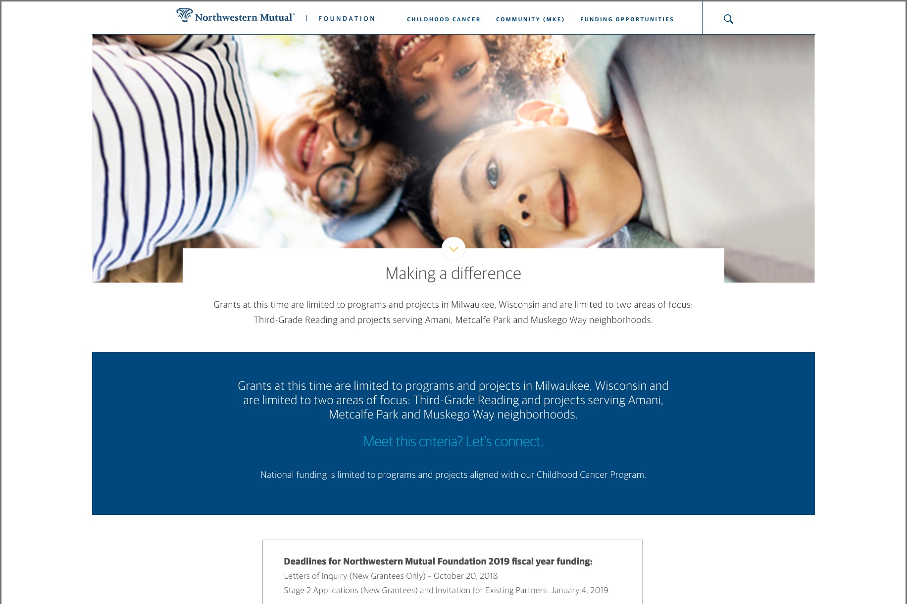
Brand Refresh: Northwestern Mutual Stationery
Finalize and polish the rebrand guidelines and how it relates to not only Northwestern Mutual stationery, but rules in relationship to partners, co-brands for printers to be able to be print easily by digital order, saving precious time and cost.
Rebranded Existing Assets: Implement the corporate rebrand to 100s of existing assets with updated protocols, legal language and design. Flesh out different uses of approved visual elements while maintaining clarity and readability.
3-D Viewer for Butterfly Island by Northwestern Mutual Foundation
Job Description: Work with a printer to create a 3-D game viewer for an immersive experience for children in the hospital. Works with the app being created “Butterfly Island”. Integrate the assortment of colored butterfly pictures provided by the children.
Solution: A tropical outdoor escape for the children in midst of fighting and recovering. A design should reflect the fun, and aid in the immersive experience while explaining the charity and the goal of the partnership. The backflap must be able to fit and support the a standard size for a smartphone.
Web page design for Northwestern Mutual
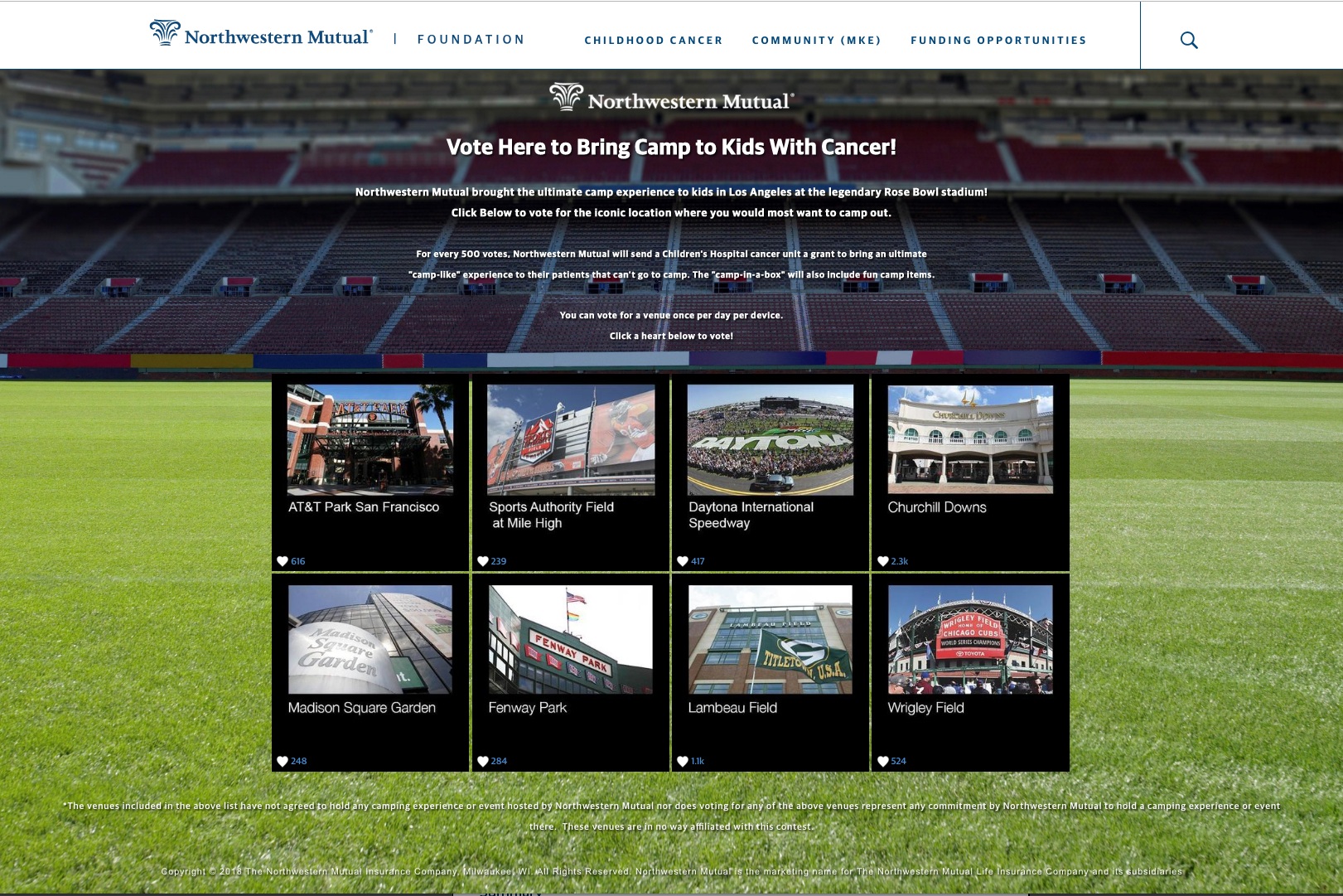
Web page for Northwestern Mutual yearly campaign for Kids With Cancer
Logos
Illustration
Giannis Antetokounmpo painting
Vector Design for nursery
Wolverine painting

Animations
KJS Design Logo Animation
Google Maps animation for CRM demo video - Click here to watch video
Word and phone animation for CRM video - Click here to watch video
For any commission requests, Interview requests, questions or other requests, please fill out the info below.
Otherwise email yakoraproductions@gmail.com
